
Share |
Art Review: Woodstock Prints Past & Present
Photos Courtesy Woodstock School of ArtBy Raymond J. Steiner
ART TIMES online October 2012
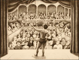
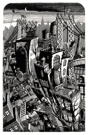 Karen Whitman "Fantasia On Brooklyn" linoleum block print Karen Whitman "Fantasia On Brooklyn" linoleum block print |
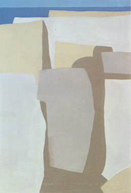 Robert Angeloch "Stream Bed" serigraph |
NEARLY 40 SEPARATE works from approximately 30 different artists comprise this show, its range of images and print variations going a long way towards showing just how complex the “print” medium is. Deceptively simple in its usual description as a “print”, the somewhat bluntly stated “print” in fact has a very long history as well as a veritable plethora of manifestations that have grown – and continue to grow — since its very first appearance (some believe in ancient China, where pre-historic “rubbings” “printed” from gravestones are still being discovered today) and on through its still evolving expressions — all of which is readily apparent in this exhibition. Some dozen different “prints” — from wood engravings to intaglios (one described in the mouth-filling description as an example of “etching/relief/digital/hand punching”) are included in this survey, yet lumped together simply as “prints” — give some idea as to how variable the print medium is and, given that the motifs chosen by the artists range from realistic to abstract, one may well wonder how to evaluate a given work when the “apple and orange” conundrum is multiplied ad infinitum. Furthermore, Ron Netsky, curator of the show, has managed to glean a survey that indeed covers Woodstock’s “Past & Present”, including a roster of both deceased and living artists that covers a good many years. It would indeed be an intrepid juror to vote this one or that as “Best in the Show.”! For example, I may prefer Whitman and Pantell’s starkly realistic graphics to Angeloch’s somewhat austerely elegant abstractions — but we are also comparing etchings, linoleum block prints and serigraphs as well as at least one separated generation!
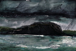
 Paula Nelson "Coastal View" monotype |
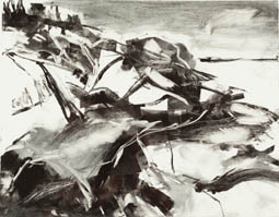
 Kate McGloughlin "Horse Island" silk screen monoprint |
So, how can one critically assess the one as aesthetically “better” than the others? What one can say about the show as a whole is that it is a fine array of artistic talent — from the abstract (Angeloch), through the painterly (Nelson, Segalman) to the realism (Whitman, McGloughlin) — and so on. Had this show been mounted at the height of Social Realism, one might have balked at the lack of political/social message — since it was the print that was thought the medium par excellence of the period (although, at a stretch, one might point out Bellow’s Murder of Edith Cavell as a “social” comment). Paintings were deemed by the Socialists to be for the “elite”, while prints, in their easy duplication and low(er)-cost production, were for the “masses.” I can still recall the wives of Jack Levine (Ruth Gikow) and Ben Shahn (Bernarda Shahn) extolling the making of prints in lieu of painting, since it was an economical way of “educating” the masses. (I still have examples of both Bernarda’s and Ruth’s work in my home.) I also have a large print depicting a vase of sunflowers in my living room, a gift from Françoise Gilot who graciously presented it to me after we spent the greater part of a day at Solo Print in NYC. I watched her going through the various “states” as she urged it towards what she considered its final stage. Ah ha! So, the “print” has not only evolved over time, but does so even within a discreet, individual, single work of art! How many “prints” might I have come home with, had she given me a copy of each state? (I lost count early on as I watched her add this touch of color, that line.) I could have been happy with any one of those “states”, yet the “AP” alongside her signature clearly designates the one on my wall as the one that she preferred. So, does the “AP” (Artist’s Proof) definitively declare it as a “print”?
 Lucile Blanch "At The Bobino" Lucile Blanch "At The Bobino" lithograph/ chine-collé |
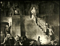 George Bellows "Murder of Edith Cavell" Etching George Bellows "Murder of Edith Cavell" Etching |
I assume the technical answer is “absolutely”, and yet… On the other hand, even when an “etching” is an “etching”, when is it a genuine “etching”? Some years ago, I wrote a book about the etchings of the Cologne-based artist, Heinrich J. Jarczyk. An advocate of the “old” school, Jarczyk stoutly declares that an etching can only be a black and white work of art. He decried those etchings he came across in America that were “colored” as abominations, and not deserving of the name “etching”, which he declares, is a black and white art, pure and simple. I do not know what they ought to be called, but I do know that many moderns have added color to their “etchings” in an effort to make them more saleable. In Jarczyk’s opinion, the fact that Americans crave color rather than purity does not mean it is OK to debase an artform. Is there a “right or wrong” opinion when it comes to the making of or evaluating an artform? When is a “Print” not a “Print”? When is it advisable to cut short a “Review” when it is obviously going farther and farther afield? Kudos to Ron Netsky for casting his net widely in curating this thought-provoking show and to the Woodstock School of Art for continuing the Woodstock Art Colony Legend by not only hosting this interesting and informative exhibition but by continuing to carry the torch by providing an ongoing series of world-class exhibitions and classes.
Woodstock Prints: Past and Present: (thru Nov 3): Woodstock School of Art, Rte 212, Woodstock, NY (845) 679-2388. Woodstock School of Art