Art Essay: Does Art Do Anything for our Uncertain Political Climates?
By Jean Bundy
ART TIMES Jan 15, 2017
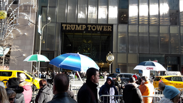
 Trump Tower (2016) |
As a transplanted East-coaster who has spent the past forty years living in Alaska, I truly miss Christmas in New York City, the fairyland windows up and down Fifth Avenue, and even the curbsides of slushy snow that you can’t quite jump over after the crossing light changes in your favor. When I first came to Anchorage, I cried when buying a box of cheesy tree ornaments at Pay ‘n’ Save, an early box store. Eventually, I was able to afford to visit Gotham during the holidays again, enjoying the bus ride from The Met to the lions at the Public Library, a treat that allowed me to endure cold dark January in Alaska.
As the kids tugged to attend college back East and eventually settled there, husband Dave and I have become frequent flyers to Newark’s airport. This recent holiday season, walking up Fifth Avenue seemed different though. Sadly, Trump’s recent victory had flooded the streets with cameramen and gawkers. Bergdorf’s fantasy windows of blues and greens and the multicolored lightshow projected onto Sak’s façade seemed disjointed against the hordes of police and parked squad cars, needed to protect the Tower. Still, Fifth Avenue over the holidays beats any suburban mall and besides, I came to see this fall’s line-up of museum exhibitions that continue to provide insight no matter what is happening politically.
I have loved The Metropolitan Museum since I was taken there for lunch as a child and told I couldn’t swim in their indoor fountain. There is that generational connection as my grandmother and mother climbed those iconic grand stairs, which now my grandkids have experienced, better than anything at Trump Tower. On view: Jerusalem 1000-1400, Every People Under Heaven (thru January 8) displayed manuscripts, shards of pillar-capitals, metal works as jewelry or relics of temple ceremonies. Craftsmen, who practiced a variety of religions, hand carved or ground pigments, before electric tools or store-bought paint existed; all with the back drop of religious/territorial wars that continue unresolved to this day. I was overwhelmed by the cartoon-like imagery of Crusaders on horseback, gorgeous handwriting by patient calligraphers and artists who communicated stories without the aid of perspective or much understanding of the physical properties of their pigments.
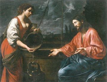
I next wandered through the works of French Caravaggio-esque painter Valentin de Boulogne (1591-1632) (thru January13) who plays with strong values of reds, mustards and blues as he portrays the suffering found in biblical stories, manipulating light against dark for dramatic effect, realistically set in perspectival space. I wondered are human conflicts perceived by conquering the perception of depth as opposed to the flattened imagery found in Jerusalem 1000-1400? Do all these morality tableaux tell us more about human nature than the impromptu selfies we take? Today, we rely on digital photography by news cameramen who can manipulate a scenario as much as de Boulogne could maneuver his models into exaggerated narratives.
 de Bouologne's Christ and the Samaritan Woman (1627) |
On successive days, I continued to dodge icy-clogged gutters taking buses and subways in soggy running shoes to see what was at the other museums. Interesting that the Guggenheim and the new Whitney down in Chelsea’s meat packing district both had shows that promote color over line and narration. Line and color have sparred throughout the history of art, with line generally winning, until recently. Guggenheim’s Agnes Martin (1912-2004) Retrospective (thru Jan 11) reduces color to its faintest tonalities. Martin also shows how the same hues can be perceived as seemingly variable to the onlooker, when placed in a grid. Walking down the Frank Lloyd Wright ramps, viewers have to bring their own explanations to her puzzles, as squares appear to change shape or disappear entirely. What made Martin obsess over the importance of color versus line? Can obsession lead to truth as she thought, or did she limit herself in her quest for greater understanding as we often do as citizens?
At the new Whitney, Carmen Herrera’s (b.1915) Lines of Sight (thru January 9), turns up the color volume, as bold primaries cut across her canvases forcing viewer’s eyes into slim crevices, defying Complementary rules about red needing to react to green, etc. Herrera’s blacks and whites quickly come to the soothing aid of knife edge shapes. Hungry after all the geometry, Dave and I elevated to the eighth floor Studio Café which was unusually empty thanks to holiday shoppers going elsewhere. We sampled carrot, butternut squash soup with crème fraiche and hazelnuts while gazing onto an uptown skyline with the myriad of buildings being remodeled or newly built, sandwiched in between rooftop gardens and wooden water barrels.
Reducing a composition to just color surfaced throughout the twentieth century. Russian Constructivists like Malevich isolated color from the object it was associated with. Mondrian placed colors in grids which attempted to give hue some semblance of order and narration. If the viewer stretched imaginings, he could find hidden landscapes. In the Vietnam era, Frank Stella lyrically made hard edges of color dance, a needed comfort in the post-World War II uber-consumer era of great political divide. I wondered what this revival of color at the Whitney and Guggenheim meant today, as across Manhattan it spatially bracketed the congestion/disruption at Trump Tower. Similar to isolating color, perhaps segregating aspects of our peculiar political times will be the only way to envision what we have become.
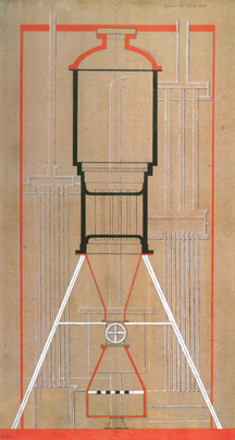
 Picabia 's machine sans nom (1915) |
Over at MoMA, was the avant-garde Frenchman, Francis Picabia’s (1879-1953) exhibition, Our Heads Are Round so Our Thoughts Can Change Direction (thru March 19). Once, I had a professor who likened Dada to a ringing phone that never gets answered. Picabia is known for his graphic designs of fanciful machines, but his paintings, especially ones that layered pencil and oil over multiple renderings, set assorted narrations in motion with a controlled Dada craziness, not unlike the banks of reporters on the West side of Fifth Avenue that become optically superimposed onto people in front of Trump Tower, waiting and waiting like a Dada phone that continuously rings. Time for lunch and MoMA’s Café 2 is one of my favorite museum eateries. Sitting farm style on long tables, you’ll chat with foreigners and the occasional celebrity, enjoying olives and cured meats with olde nineteenth century New York mansions back-dropped out the windows.
Over at The Met Breuer, the former Whitney building on Madison and 75th, now an annex of the Central Park Met, was Kerry James Marshall’s (b. 1961) show, Mastry (thru Jan 29). I remember Marshall at gallery openings when I was a grad student in Chicago. Marshall’s huge canvases portray the life of ordinary African-Americans with the occasional jab at the white majority. His title Mastry, omits the letter “e” thereby erasing/transforming the word “master,” synonymous with black degradation and cartooning, into more positive considerations.
The Breuer is a strange place. Although it was recently remodeled for The Met, it still feels like the old Whitney with its hard-to-walk-on cement floors and arrow slit windows that don’t accomplish the task of bringing the outside inside. I also wondered if showing at The Breuer as opposed to the 5th Avenue flagship wasn’t in some way saying Marshall had not quite arrived into the art canon.
Dave and I decided to try lunch at Breuer’s basement Flora Bar. Arriving, we were told the café was still in transition, odd as they’ve had plenty of time. The chicken sandwich on some long stale roll was tasteless. Except for a dad who lunched with his preppy-blazered-iPhoned son, we were alone to drink tea while viewing the vacant sculpture garden out the leaky storm windows and the legs of passers-by, their tactile presence contrasting with the iconic concrete that has become the bugaboo of this building. As Dave and I were about to leave, we visited the gift shop on the main floor. A giant catalogue about David Hockney cost many hundreds, including a lectern that was needed to cradle the book. Was this gospel according to Hockney a joke? Other than a few books, the store contained quick pick-up-gifts for someone who has everything and probably won’t want anything more. The shop lacked energy and didn’t compare to the one at the main museum with its warm lighting, candy store of art books and Met paraphernalia.
Fall 2016 exhibitions in Manhattan’s premier museums seemed to be making statements either political, as in the case of Picabia, or metaphorical as with Martin’s and Carerra’s objectification of color. Through the works of Valentin de Boulogne, with his curiosity for greed and suffering, and Jerusalem 1000-1400, the human condition continues to be expressed in art no matter what political climates or biases and uncertainties exist, a needed message for the coming year. Keep on sleuthing for art.
If you missed the exhibitions, show catalogues are available through Amazon and many works can be viewed by going to specific museum websites.
Jean Bundy AICA-USA is a writer/painter living in Anchorage, Alaska
Email: 38144@alaska.net
